

Footprint Charts Explained: Bid/Ask and Imbalances
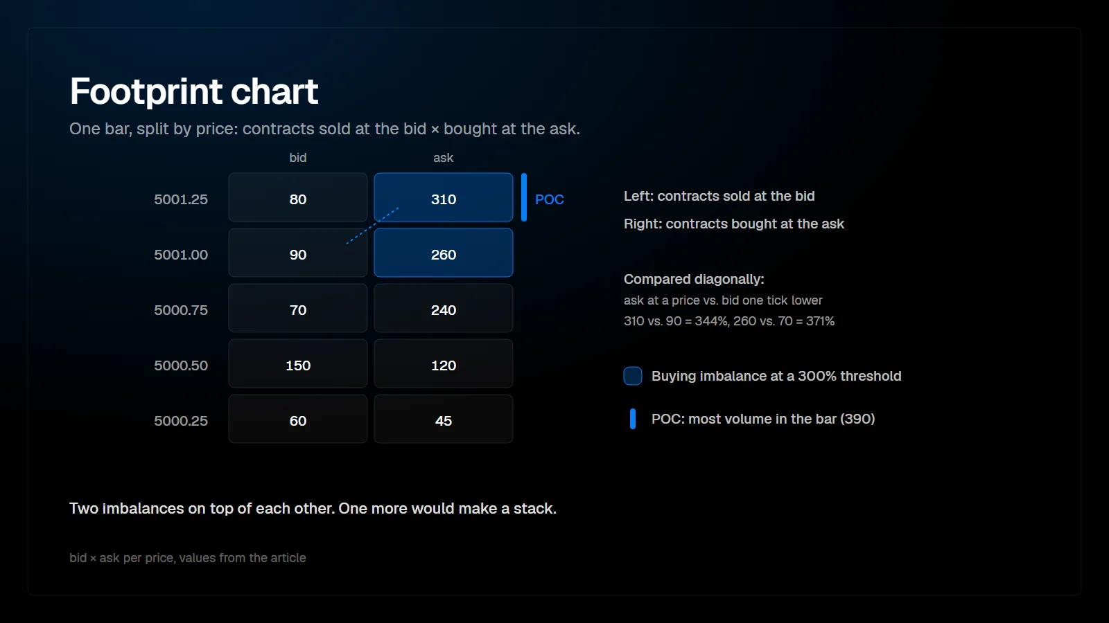
A footprint chart splits each candle into its individual price levels and shows how much volume traded at the bid and at the ask at each one. Instead of only open, high, low and close, you see where inside the bar buyers and sellers were aggressive, and where one side overwhelmed the other.
What does a footprint chart show?
The transactions inside each bar, price by price.
A normal candlestick compresses a bar into four prices. A footprint, also called a cluster chart, keeps the volume distribution. For every price the bar traded, it shows the number of contracts sold at the bid and bought at the ask. In CME futures this split comes from the exchange's aggressor flag, so it is a record, not an estimate.
Most platforms offer several display modes for the same data.
| Mode | What each cell shows | Best for |
|---|---|---|
| Bid x Ask | Contracts sold at the bid and contracts bought at the ask | Reading aggression and imbalances |
| Delta | Ask volume minus bid volume at that price | Seeing net aggression per price quickly |
| Volume | Total contracts traded at that price | Finding high and low volume inside the bar |
| Profile | A small histogram of volume per price | Spotting the bar's point of control |
Common footprint display modes. Names vary by platform.
How do you read bid x ask numbers?
Read the left number as selling aggression and the right number as buying aggression at that price.
In the usual bid x ask layout, the left column is volume that traded at the bid, meaning sellers crossed the spread. The right column is volume that traded at the ask, meaning buyers crossed the spread. Example: a cell reading 120 x 340 says that at this price 120 contracts were sold aggressively and 340 were bought aggressively.
The bid and ask in the same row are not directly competing, because at any moment the best bid and the best ask sit one tick apart. That is why imbalances are compared diagonally.
What is a diagonal imbalance?
A diagonal imbalance compares the ask volume at one price with the bid volume one tick lower. If buyers lifted the offer at 5001.00 far more than sellers hit the bid at 5000.75, buyers dominated that price transition.
Platforms flag an imbalance when one side exceeds the other by a chosen ratio. Many traders work with ratios somewhere between 150 and 400 percent, usually combined with a minimum volume so that 3 contracts against 1 is not flagged. The threshold is a setting, not a standard, and it should be tested per instrument.
| Price | Bid | Ask | Diagonal comparison | Buying imbalance? |
|---|---|---|---|---|
| 5001.25 | 80 | 310 | 310 ask vs. 90 bid at 5001.00 | Yes (344%) |
| 5001.00 | 90 | 260 | 260 ask vs. 70 bid at 5000.75 | Yes (371%) |
| 5000.75 | 70 | 240 | 240 ask vs. 150 bid at 5000.50 | No (160%) |
| 5000.50 | 150 | 120 | 120 ask vs. 60 bid at 5000.25 | No (200%) |
| 5000.25 | 60 | 45 | No lower row in this example | n/a |
Example: ask at each price compared with the bid one tick below, at a 300% threshold. Values are illustrative.
The two flagged rows sit directly on top of each other. With one more, they would form a stack.
What are stacked imbalances?
Stacked imbalances are three or more consecutive prices with imbalances on the same side. They show that one side was aggressive across a range of prices, not at a single tick.
Traders often watch stacked buying imbalances as potential support if price returns to them, on the reasoning that aggressive buyers initiated there. That reading is a hypothesis to test, not a rule. A stack that price cuts straight back through on heavy selling has been invalidated.
What is an unfinished auction?
An unfinished auction is a bar extreme where both bid and ask show volume at the high or at the low. A finished auction ends with zero volume on the aggressive side at the extreme: at a high, nobody was willing to buy higher, so the ask side prints zero at the top.
When the high of a bar shows volume on both sides, the auction at that price was not completed. Some traders expect price to revisit such prices. It is a tendency worth knowing, and it is weaker on small bars in fast markets.
Which chart type works best for footprints?
Footprints work on time, tick, volume and range bars. Time bars make sessions comparable. Tick or volume bars keep the information content of each bar more even, so a fast open does not compress into one unreadable candle.
- Time bars (1 to 5 minutes): easy to compare with other charts and sessions.
- Volume bars: each bar holds the same number of contracts, which normalizes busy and quiet periods.
- Range bars: each bar covers the same price distance, which keeps footprints at a readable height.
For NQ, which covers many ticks per minute, grouping several ticks per row keeps the footprint readable. ES footprints are usually readable at one tick per row.
Settings from our ATAS X footprint masterclass
Our footprint masterclass builds a volume and delta footprint in ATAS X step by step. A few of its choices are worth copying as a starting point.
| Setting | Choice | Why |
|---|---|---|
| Chart type | Range chart, 16 ticks (4 points) on ES | Shows absorption and the push of aggressive against passive orders more clearly than a time chart |
| Footprint content and mode | Volume, with the mode set to volume profile and a solid color scheme | Shows where most volume traded inside each bar, even when zoomed out |
| Proportion mode | Bar, not visible region | With visible region the coloring changes whenever you zoom; with bar it is calculated per bar |
| Price scale on NQ | 4 ticks per row on a 64 tick range | Without grouping the NQ footprint is too granular to show patterns |
| Cluster search | Set to delta with a minimum value, for example around 250 on ES | Marks delta outliers, such as heavy selling that is absorbed at a low |
Settings as used in the masterclass. Thresholds differ per instrument, so save one template per instrument.
How do you use a footprint without overload?
Use it at levels, not everywhere. Mark the prices that matter before the session, then read the footprint when price arrives. The questions are few: is one side aggressive here, does price respond, and does the other side absorb? Heavy bid volume at a low that holds is the footprint form of delta divergence, covered in the article on delta divergence and absorption.
In ATAS the footprint is the cluster chart, with the imbalance ratio and minimum volume set in the cluster settings. The PFT Institutional Detector works on the same trade data but answers a different question: not how aggression is distributed inside a bar, but where the largest individual trades actually hit the tape.
FAQ
Is a footprint chart the same as a cluster chart?
Yes. Cluster chart is the term ATAS and some other platforms use. The data is the same: volume per price inside each bar, split by aggressor side.
What imbalance ratio should I use?
There is no correct ratio. Start around 300 percent with a minimum volume filter and adjust per instrument until imbalances highlight meaningful aggression rather than every other row.
Why do footprint numbers differ between platforms?
Mostly because of data feed aggregation, session and time zone settings, and how trades are grouped into bars. The raw exchange data is the same.
Can footprints be used on stocks or crypto?
Yes, but the quality of the bid and ask split depends on the data. Futures on a single exchange provide an aggressor flag. In fragmented markets the platform has to infer the side.
This article is educational content, not financial advice.