

What Is the Heatmap in ATAS? Liquidity, Aggression and Setup
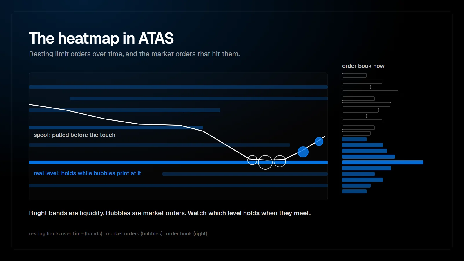
The Heatmap in ATAS is a standalone module that draws the resting limit orders of the order book over time. Brighter bands mean more liquidity at that price, and bubbles mark executed market orders. Together they show where passive traders wait, where aggressive traders hit, and which side wins the fight at a given price.
What does the ATAS Heatmap show?
The history of the order book, plus the trades that hit it.
A DOM is a snapshot: it shows the limit orders resting near the market right now. The Heatmap keeps that information over time. Each price is colored by how much liquidity rested there relative to the rest of the book, so large resting orders appear as bright horizontal bands that last until they are filled or pulled. ATAS describes the Heatmap as a view of limit orders over time and states plainly that a bright zone does not guarantee a price reaction.
On top of the liquidity, executed trades appear as bubbles. The background is the passive side, the limit orders that wait. The bubbles are the active side, the market orders that cross the spread, sized by volume. Reading the Heatmap means reading both layers at once.
| Layer | What it shows | Side |
|---|---|---|
| Colored background | Resting limit orders per price over time; brighter means more relative liquidity | Passive |
| Bubbles | Executed market orders, sized by volume | Aggressive |
| Best bid and ask lines | The current inside market | Both |
| Volume columns and CVD panel | Aggressive buying and selling per interval, and its running total | Aggressive |
The layers of the Heatmap and the side of the market they represent.
Which heatmaps does ATAS offer?
ATAS uses the word heatmap for four different tools, and they are easy to confuse.
| Tool | Type | What it colors |
|---|---|---|
| Heatmap | Standalone module, opened from the Home tab | Resting limit orders over time, plus trade bubbles |
| DOM Trader, mode Liquidity Map | Indicator on a chart | Order book liquidity next to price |
| DOM Levels | Indicator on a chart | Order book liquidity as a heatmap behind the candles |
| Footprint modes Heatmap by Volume, Trades or Delta | Cluster chart coloring | Traded volume, trades or delta per price, not resting liquidity |
Heatmap-type tools in ATAS. Only the first three show order book liquidity.
This article is about the standalone module. It started as a beta in spring 2026 and is available in ATAS Classic and in ATAS X. The footprint heatmap modes only color volume that has already traded; they say nothing about orders that are still waiting.
What data does the Heatmap need?
Level 2 market depth, not only trades.
Because the Heatmap draws the order book, it needs depth data. For futures, ATAS names Rithmic and CQG connections for this, and CME depth is usually a separate data subscription. Without depth there is nothing to draw in the background. The module also relies on Vulkan rendering, which older graphics setups may not support.
Which Heatmap settings matter?
A handful: palette, bubbles, cutoff, smoothing and the panels below.
Phil's first look at the Heatmap, recorded while it was still a beta for ATAS partners, walks through the settings panel. Names and options can change between versions, so treat the table as orientation rather than a reference.
| Setting | What it does | Choice in the video |
|---|---|---|
| Color palette | Color scheme of the liquidity background | The standard palette, or grey and white for a calmer picture |
| Show trades | Shows or hides the trade bubbles | On |
| Bubble content | Pie (buyers and sellers inside each bubble), delta or volume | Volume, to see the size of the dominant side |
| Bubble radius | Size of the bubbles | Around 20 |
| 3D mode | Renders liquidity as walls with height | Optional, shows the size of a level at a glance |
| Cutoff | Filters small limit orders so only larger levels remain | An upper value around 30 contracts |
| Smoothing | Merges nearby levels into zones | Auto |
| CVD panel | Cumulative delta below the heatmap, from the start or from the visible range | From the start |
Settings shown in the video, with the choices made there. Adjust per instrument.
Two details help in daily use. Holding Ctrl while hovering over a level shows how many contracts rest there, which is useful when the depth indicator is switched off. And at the time of that recording, indicators and drawings could not be placed inside the Heatmap, so levels were marked on the regular chart next to it.
Why stick to one Heatmap setting?
Because the picture only becomes readable once it looks the same every day.
Our walkthrough on qualifying breakouts makes this the first rule: choose one configuration and keep it. Heatmap colors are relative. If cutoff, palette or smoothing change every few days, a level that looked significant last week looks ordinary this week, and nothing can be compared. The same holds for any order flow tool, but the Heatmap is especially sensitive, because its entire output is color intensity.
How do you read the fight between aggressive and passive traders?
At every key level, ask two questions: who is attacking, and who is holding?
The walkthrough treats the Heatmap as a battle between aggressive and passive participants, and where that battle takes place matters as much as who wins it. A typical case at a low: aggressive sellers keep hitting the bid and cumulative delta falls, but price does not follow through, because passive buyers keep absorbing the selling with their limit orders.
Absorption alone is only half of the picture. It shows that the passive side is strong, not that price will turn. The second half is aggression in your own direction: market orders on your side that start to move price away from the level. Only the combination turns an observation into a trade idea.
- Passive strength: large limit orders stay in place while aggressive orders hit them, and they are actually filled rather than pulled.
- Shifting limits: passive buyers move their limit orders up as price rises, which shows interest at higher prices.
- Aggression in your direction: after the absorption, market orders on your side start to move price.
- Location: the fight happens at a level that matters, such as a balance edge or a high volume area.
How can the Heatmap qualify a breakout?
By showing whether a breakout is accepted, not just whether it happened.
In the walkthrough, NQ spent the morning in a balance before breaking higher, and the first break was not traded. The setup developed when price built a smaller balance above the old one. Sellers tried to push it back down, passive buyers held the order book and placed their limit orders at higher prices, and then aggressive buyers took over again. The long had a defined risk below the low of that pattern.
The cleaner version of the pattern, as the video describes it, is a break above the area, a retest by sellers, and aggressive buyers stepping in again at the retest. A fake-out that returns into the balance while the day's bias still points the same way can offer a second chance. The walkthrough never uses these patterns alone; they are combined with the daily bias and with volume profile levels as targets.
Heatmap vs. footprint: why this workflow does without one
In the workflow shown in the walkthrough, no footprint chart is used. The screen holds a 900 tick chart with the day's tools, the Heatmap next to it, and an analysis chart with volume profiles. The Heatmap takes over the job a footprint usually does.
The reason lies in what the Heatmap shows in one picture. A footprint records the aggressive side: how much traded at the bid and at the ask, price by price. The Heatmap shows that aggressive side as bubbles, adds the passive side as the background, and shows where the two meet. Both questions the walkthrough asks at every level, whether passive traders absorb and whether aggression then follows in the trade's direction, can be answered on one screen with one fixed setting.
Footprints remain a valid way to read the same fight, and many traders keep using them alongside or instead of a heatmap. The footprint article covers bid x ask numbers, imbalances, unfinished auctions and the ATAS footprint settings.
What is spoofing on the Heatmap?
Liquidity that disappears shortly before price reaches it.
Phil's workspace video shows the pattern. A large block of limit orders appears away from the market, price moves toward it as if drawn to it, and shortly before contact the orders are pulled. The liquidity was a display, not an intention to trade. A real level behaves differently: it stays while price trades into it, and large bubbles print at the level because orders are actually being filled.
| What you see | Likely reading |
|---|---|
| A bright zone vanishes shortly before price touches it, without large bubbles | Liquidity was pulled, possible spoofing |
| The zone holds while price trades into it, with large bubbles at the level | Real resting interest that is being filled |
| Size seems to refill at the same price | Cannot be confirmed as an iceberg from the Heatmap alone |
Reading liquidity as price arrives. None of these is a signal on its own.
How can the Heatmap help with targets?
As a map of where the next fight is likely.
In his workspace video, Phil uses the Heatmap inside a trade to find the next large area of liquidity and places the profit target one or two points before it, not at it. The reasoning: price often reacts before it reaches a large level, or the level is pulled, so a target just in front of it is more likely to be filled. Round numbers deserve extra attention, because large resting orders tend to collect there, and price can reject from them or run straight through.
Does the ATAS Heatmap replace Bookmap?
For many ATAS users it removes the need for a second platform, but compare current pricing yourself.
Phil's first look compared, roughly and at the time of recording, the cost of running Bookmap next to ATAS with having a heatmap inside ATAS, and pointed out that the Heatmap scrolled smoothly even on an average PC. Prices and plan conditions change, and ATAS has described the Heatmap's plan availability differently at different times. Check the current plans on both vendors' sites before deciding.
FAQ
Is the ATAS Heatmap the same as Bookmap?
No. Both show order book liquidity over time, but the ATAS Heatmap is a module inside ATAS, so it runs on the same connection and next to the same charts.
Why does the Heatmap background stay empty?
Usually because the connection delivers no market depth. The background needs Level 2 data, so check that the connection and the data subscription include depth for the instrument.
Can a bright level be trusted?
Not on its own. ATAS itself notes that a liquidity zone does not guarantee a reaction. Watch whether it holds and gets filled when price arrives.
Is the Heatmap available in ATAS X?
Yes. The Heatmap module exists in ATAS Classic and in ATAS X. The breakout walkthrough uses ATAS X; Phil's workspace uses ATAS Classic.
This article is educational content, not financial advice.